
 Prater has unveiled its new branding and website, with an official launch at its annual Supply Chain Conference in April 2016.
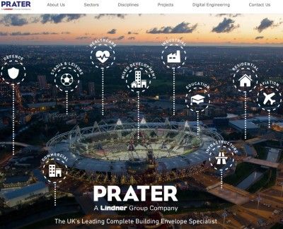
The company says its new branding acknowledges the heritage of the company by using its signature colour blue, and the new look is bold, uncomplicated and aligned with its parent company, Lindner.
In addition to allowing the company to showcase its product portfolio, the new website provides greater insight into Prater’s integration of BIM and digital engineering, looking at how this is allowing the company to de-risk the construction process and deliver successful projects for its clients.
In terms of functionality, the new site features simplified navigation, allowing users to intuitively access key information through fewer clicks via a smartphone or tablet.
Kate Prater, associate director of marketing at Prater, said: “We are very proud of our rich heritage and we are now embarking on our next chapter. Prater’s new branding and website is designed to put our projects and people very much at the forefront – with the website in particular highlighting our experience and expertise across a wide range of disciplines. We hope it will become a reference point for all, for some of the spectacular projects we have had the privilege to work on.”


